Data Storytelling: Visualizing McDonald's South America Sales in Excel 🍔📉
تفاصيل العمل
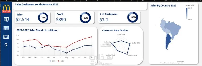
I’m excited to share my latest Sales Analysis Dashboard for McDonald's South America operations—built entirely within Microsoft Excel. The challenge was to take a massive dataset and transform it into a high-level executive summary that is both visually stunning and functionally interactive. Key Technical Features & Insights: 🔹 KPI Tracking: Monitored total Sales ($2,544M), Profit ($890M), and Customer count (87M) with dynamic target achievement percentages. 🔹 Year-over-Year (YoY) Trends: A comparative line chart showing 2021 vs. 2022 performance, highlighting a significant growth trend starting from August. 🔹 Geospatial Analysis: Integrated a Map visual to identify high-revenue markets, with Argentina clearly leading the South American region. 🔹 Customer Satisfaction Index: Used a Radar Chart to evaluate service quality, revealing high scores in Hygiene (93%) and Availability (95%), while pinpointing areas for improvement in Speed and Service. 🔹 Advanced UI/UX: Applied a modern "Glassmorphism" design and custom navigation icons to enhance user experience within a spreadsheet environment. This project proves that with the right combination of Pivot Tables, Advanced Formulas, and Creative Design, Excel remains one of the most powerful tools in a Data Analyst's toolkit.
مهارات العمل
بطاقة العمل

طلب عمل مماثل